5 Worst NFL Team Uniforms
This is looking at the whole uniform: pants, jersey, and helmet in concert. How does everything look together?
Here’s what I used for criteria: my opinion.
While I know that is lacking on specifics and details, it is the truth, and it's good enough for me... hey, it's my blog.
Here we go, starting with:

Despite what many who know me may think, this has nothing to
do with them being a division rival of my favorite team (the Chargers). The Raiders and Chiefs aren’t on this
list. So that’s not it. It’s not the color scheme because the
Virginia Cavaliers make the dark blue and orange thing work.
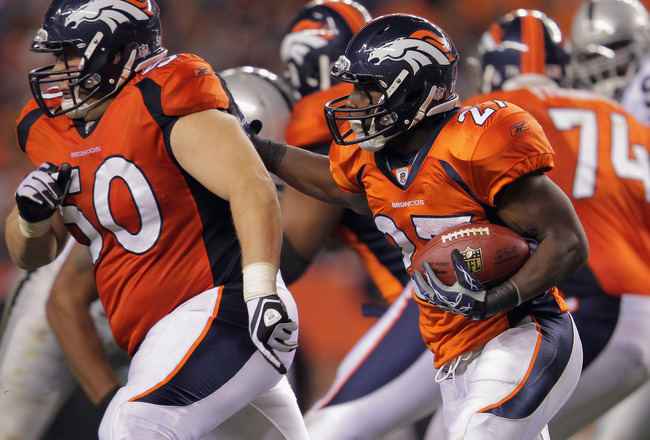
First of all, I hate the design. The little point thing on the helmet stripe? It starts out wide on the back of the helmet
and then shrinks down to a little point at the front. That looks stupid. Also, on the jerseys and pants… their stripes
come to a point… at the top of the jersey (point on the chest) and then down
the side, and finishes with another point on the bottom of the pants.
Then, we come to the ‘bronco’ on the helmet. It’s too… tooo... it’s just too much. First of all it’s enormous! And secondly, it’s too “fierce” looking. This horse is trying too hard. Maybe the actual logo wouldn’t be so bad if
it wasn’t so large. But when you put the
“fierce horse face” in combination with the size of the thing, it just looks
like it’s overcompensating for something.

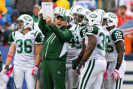
When Bill Parcells took over the Jets in the late 90’s, he
changed the uniforms and logos from the ones they had been using, to the look
the team sported during the Joe Namath era.
Most likely hoping it would “recapture the glory years” of the franchise
(they did win a Super Bowl).
Too be honest, at first I was on board with this
change. At that time the “throwback”
uniforms were popular, and the Jets uniforms at that time did leave something
to be desired. Now though, they look like something from the 1960’s, which is exactly what they are. It’s not that they are ugly like the Broncos,
they just look like something out of a museum.
The Jets need an update.
I’m not sure how, and I’m not sure what, but they need a change. You live in New York! The media capital of the world! You have one of the most vocal fan bases in
the league! You can do better! Get some PR people working on this issue. You have how many advertising and marketing
firms based in New York? There is no
reason for you to keep trotting out a team that looks like they are playing in
the same clothes that their Grandpa did.
Get with the 2000’s Jets.
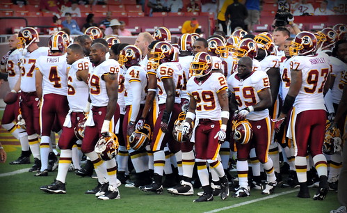
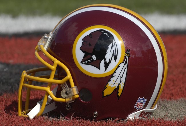
I’m not sure where to begin with the Redskins.
1.
The racially inappropriate mascot. (Redskins? really?)
3.
The horrendous color scheme. (Red and Yellow, no wait Burgundy and Gold)
First of all, it is beyond my understanding how any team could
exist in 2011 and have a mascot be named the Redskins. How is this possible? It’s the most ridiculous thing I can imagine
a team being called. What if San Antonio
got a team and started calling it the “Wetbacks”? How about the San Jose Slant Eyes? Would that be good? What if Miami’s team was called the “Refugees”
instead of the Dolphins, and had a picture of a floating Cuban refugee on the
side of the helmet?
You can talk all you want about tradition and history, and blah, blah, blah. It makes no difference. It’s wrong. It needs to go. When you also factor in that this team also represents our nation’s capital, it makes it worse.
You can talk all you want about tradition and history, and blah, blah, blah. It makes no difference. It’s wrong. It needs to go. When you also factor in that this team also represents our nation’s capital, it makes it worse.
So, Washington fans you need a new mascot, which also means
a new logo, why not go for wholesale changes while you are at it? I don’t think the next team should be that burgundy and gold color scheme. You can't have a "new identity" with the same colors. It could
be close, but different.
How about maroon and gold like the University of Minnesota? That would be close, but a change, and a change is needed. Think of it this way, when you’re going out, and you want to look good… who puts on Burgundy and Gold together? How about Red and Yellow, for that matter? It’s not a good color scheme to begin with, so you may as well change that.
How about maroon and gold like the University of Minnesota? That would be close, but a change, and a change is needed. Think of it this way, when you’re going out, and you want to look good… who puts on Burgundy and Gold together? How about Red and Yellow, for that matter? It’s not a good color scheme to begin with, so you may as well change that.
Personally, I’d be in favor of naming the team the
Washington Senators like the old baseball team.
But that is all beyond the point, which is that this uniform, logo, and
mascot NEED TO GO. Do the right thing, Dan Snyder. Just do it.

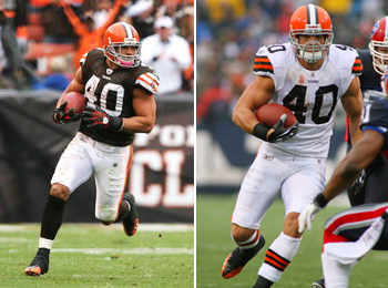
The ugliest uniforms in professional football, hands
down. Possibly the ugliest uniforms in all of professional sports. The Browns aren’t going to win any
beauty contests. From the plain white jerseys
with the orange pants, or the brown jerseys with the white pants, these things look terrible.
First off, this was a fine look back in the way back… you
know, before teams adorned their helmets with logos and graphics. But teams have been doing that for a while. The Browns stubbornly refuse to change. OK, so you like a simple helmet. You do notice that your helmet is colored
Orange? The team is named the Browns,
but you wear Orange helmets?
I know the team is named the Browns after the legendary
coach Paul Brown. I get that. I even think it’s cool. But couldn’t you incorporate something about
that? You’re just plain. These are the most boring and plain looking
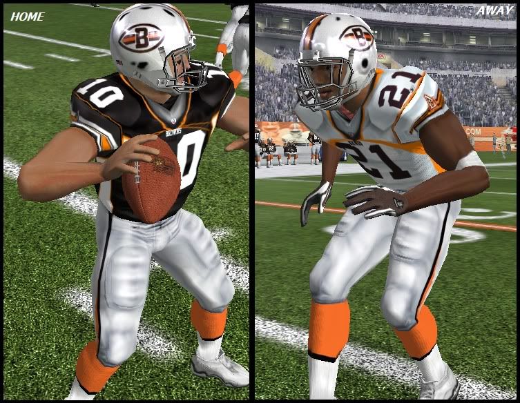
things you can imagine. And you know what, it would not be hard to change to something better. A quick internet search of Cleveland Browns Uniforms, found me these "fan made uniforms'. Those look pretty sweet, right? Much better than what they actually wear.
In fact, the only thing that prevents them from being the #1
worst uniform in the League is this… they are so ugly that Browns fans are
proud of this. They relish the fact that
they are “the Browns” and that they are plain, and their fans are “the dogpound”. This fact prevents them from
being the worst, however they are still ugly.
But there is one worse...
But there is one worse...
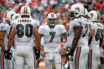
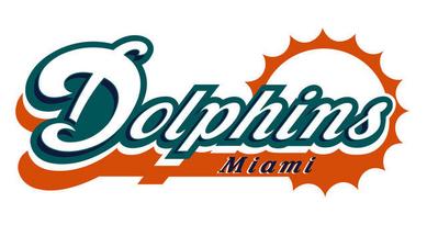
Where oh where, do we begin with the Dolphins? Should we start with the mascot? Who is intimidated by a Dolphin? How about the color scheme? Aqua and Coral sound more like stripper names
than a football team’s colors. And let’s
call them what they are: Teal and
Orange. Let’s move on to the logo on the
Helmet. A cartoon dolphin, wearing a
football helmet (with an orange M on it) jumping in front of a silhouette of
the sun. Wow.
Does anyone find it ironic, that the Dolphin on the helmet
is actually wearing a cooler looking helmet, than the helmet it is appearing
on? Seriously, look closely at that
helmet… a plain and simple orange M looks better than what they have on there.
Miami, it’s time to wake up.
You are happening, you have South Beach, you have beautiful ladies,
beautiful weather and tremendous football history. You can do better than this. Allow me to make a few suggestions:
Did you know that one of the Dolphins official colors is
Navy? It’s absolutely true. What are you doing dressing in teal and orange
(OK fine, have it your way, Aqua and Coral)?
You need to incorporate some Navy into those uniforms. How about the pants? They could be Navy with a two color coral and
aqua stripe up the side (similar to what you have now). I understand wanting to wear white down there
in the heat…but instead of teal, um, aqua numbers on the jerseys go with Navy
and outline the trim in coral and aqua.
You should keep the Dolphins are your mascot. But change the logo. Almost anything is better than what you
have. Change the helmet while you’re at
it. It doesn’t need to be an M, it could
be anything, shoot a scripted “Dolphins” looks
better than what you have now.
So there you have it, change you helmets, change your logo, and
God’s sake incorporate some Navy into your uniforms. It’s one of your colors, use it.
My next post will be on the Top 5, and you know that you want to know.
My next post will be on the Top 5, and you know that you want to know.
When you want to access for USA Football live streaming on PC, OR multiple devices you should go here. It's almost free.
ReplyDeleteGet ready for the 2019 NFL Season Download Programs On-Demand
Watch NFL Network Live 24/7
Watch NFL live streaming
Watch NFL live streaming
Watch NFL live streaming
Being a vampire is not what it seems like. It’s a life full of good, and amazing things. We are as human as you are.. It’s not what you are that counts, but how you choose to be. Do you want a life full of interesting things? Do you want to have power and influence over others? To be charming and desirable? To have wealth, health, and longevity? contact the vampires creed today via email: Richvampirekindom@gmail.com
ReplyDelete