For the 5 Worst Uniforms, click the link.
Once again,
This is looking at the whole uniform: pants,
jersey, and helmet in concert. How does everything look
together?
Here’s what I used for criteria: my opinion.
While I know that is lacking on specifics and details, it is the truth, and it's
good enough for me... hey, it's my blog.5. Arizona Cardinals

A few things to mention. I do NOT like the Cardinals alternate black uniforms. They don't look right. The reason these uniforms look sharp is because of the bright Red. You take that away and replace it with Black, and it just looks blah.
A quick suggestion for the Cardinals... for your "alternate" uniforms. Red Helmets. You may think a Red Cardinal on a Red Helmet would looks weird, but it really doesn't. So, get rid of the Black Jerseys... and strap on Red Helmets.
4. Tampa Bay Buccaneers

Probably the greatest uniform transformation of all time. There is not one thing, not one single thing, about the old Tampa uniforms that was better than the new version.
The color scheme: From the old Orange, Red, and White to Red, Pewter, and Black.
The logo: From the Gay Pirate to Skull and Crossed Swords hanging on a flag, hung on a sword.
The helmet: From This to This.
Do you remember the Buccaneers before the change in 1995? They went from a joke, a farce, and someone that no one feared into a legitimate contender. Almost immediately. Never has the fate of a franchise changed more drastically. The Buccaneers changed the image and the perception of their team in one fell swoop. (Hiring Tony Dungy didn't hurt, either.) This is why uniforms are important. Players play feel better about themselves when they look good. They feel better, they play better.
3. New York Giants

Simple. Clean. Elegant.
To be honest, I never thought there was anything wrong with the Giants Uniform in the Bill Parcells era. Those were pretty good looking. They weren't Top 5 in the league, but they looked good.
Here is where just a slight, subtle adjustment, can make a huge difference. The helmet has changed both in color and logo. The "new" helmets are brighter and more colorful than the old ones. Technically, they are both blue with a red stripe, but the change is definitely for the better.
The logo went from GIANTS to NY. Again, the difference is slight, but I like it. Two Color scheme on the logo from one. And something about the lowercase lettering looks cooler too. I just like what they did here. More colorful. More modern. And still, simple and easy.
And I love the Gray pants. How many teams do that? One. The Giants. It sets them apart. It makes them different. These would have been my second favorite except for a major uniform overhaul in the past off season by the....
2. Buffalo Bills

I'm going to be honest here, I've been waiting for this change. The past few years whenever I saw the Bills on television I would text my brother and say something along these lines, "I really wish the Bills would go back to their throwback uniforms, they look better than these things."
The Bills uniforms were awful. The Red helmets look like something from the 80's. They weren't terrible, but mixed in with all the color in the uniform... There's no contrast. They're all Blue and Red, it hurt the eyes. Another thing I didn't like about them is the weird shoulder square thing. It's more notable on the white uniforms, but it's even there on the blue ones? What the heck? And if you have a Blue shoulder thing on the white uniforms, shouldn't you have a White shoulder thing on the Blue ones?
Buffalo General Manger Buddy Nix, used to be the Assistant GM to the San Diego Chargers. He took a page out of his old team's book. He changed the uniforms so that it looked like the throwback uniforms, but had their own charm. They pay homage to the bills of old, without exactly copying it and looking like they belong in a museum like like the Jets did. Straight out of the Chargers playbook. Going back to the white helmets? Check. Going back to an old color scheme? check. Well done, Bills, well done.
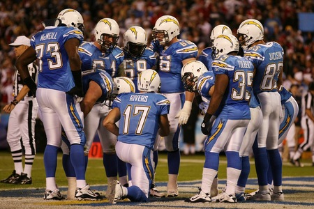
1. San Diego Chargers -The Hands Down best looking uniforms in the league.

"Home"
I'm fully prepared for the cries of "Homer!" and "That's your favorite team, of course you like them the best!" Listen, it's not my fault that my favorite team also has the best looking uniforms in the league. It's just the way it is. If I were a Packers fan, I would not be claiming we had the best looking uniforms in the league. Because they don't. If I were a Bears fan, I would not think the Bears had the best uniforms either, because even though they are fine, traditional, and classic... they aren't cool. The Chargers uniforms are cool.

"Away"
This is why I have included photos of each of the three styles, Home, Away, and Alternate. Look closely at each of these photos. And then think back to the five worst uniforms, as recorded yesterday. Do the Chargers uniforms do anything like those teams?
Are they:
Trying too hard to be audacious, like the Broncos uniforms?
Relics of the past like the Jets uniforms?
Racially and culturally inappropriate, as well as poorly colored, like the Redskins?
Plain, bland, boring and ugly like the Browns uniforms?
Wimpy, new age colored, and adorned with a silly looking mascot?
"Alternate"
Let me answer each of those questions with one answer, "NO". Here is how nice looking the Charger uniforms are, first of all imagine a little kid... 6, 7, 8 years old... and put him in a room full of NFL jerseys and let him pick the one he likes the most (we have to imagine he knows nothing about football, and has no favorite team or anything.... just picking on which jersey he likes the best). More than likely he's coming out of there with the one that has Lightning Bolts on it. What would you pick.... one with a bird on it?
I was watching a pre-season game of the Chargers this summer, and my wife looked up from the computer and says, "When you picked them as your favorite team, did you do it because their uniforms look so cool"? Honestly, it played a role. I was 10 years old. This was basically pre-espn, and I'd never heard of them. (Remember the NFL didn't dominate the culture of the nation in those days, as it does now.) I saw this cool looking team, throwing the ball all over the field, putting up tons of points. (Dan Fouts and the Air Coryell era Chargers)
Listen, as a Chargers fan, they've never won the Super Bowl. They may never win the Super Bowl (Particularly the way the current version of the team is playing). Can't you just admit that their uniforms look good? It's not like saying they're the best team. Just the best dressed. Is there anything wrong with that? Not in my opinion. Of course, Chiefs, Broncos, and Raiders fans are excused from giving the Chargers any credit whatsoever, and that's alright because it's obvious by your choice of team that you have made worse decisions in the past. (tee-hee)
I was texting back and forth with a friend (Steelers fan) this summer, and we were busting on each others teams a little, and he said something like "The Steelers would beat the Chargers" and I replied back with, "I don't doubt it, but the Chargers still have the best looking uniforms." To which he replied, "True. Even I won't argue that point."
So there you go. My completely unscientific, and completely biased opinion on who looks the best.
We offer a tailored solution to today's garment manufacturing. Being a family-run business,we take care of every aspect of garment production and sales.Each garment is designed to be long-lasting, durable and competitively priced for wholesale and retail environments team uniforms
ReplyDelete.
Being a vampire is not what it seems like. It’s a life full of good, and amazing things. We are as human as you are.. It’s not what you are that counts, but how you choose to be. Do you want a life full of interesting things? Do you want to have power and influence over others? To be charming and desirable? To have wealth, health, and longevity? contact the vampires creed today via email: Richvampirekindom@gmail.com
ReplyDelete